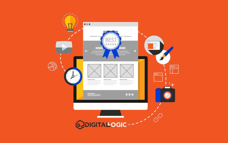

Web Design Best Practices
What is Web Design?
Website design is the umbrella term for the process of creating a website. The web design process includes the creating website layout, the production of content, graphic design, and creating other elements for websites.
Sometimes web development and website design are used interchangeably, but website design is technically a subcategory under website development.
Either way, small business owners need to understand the best web design practices before they launch their website. Customers have become much more knowledgeable and far less patient with websites that don’t operate as they should. So, web designers need to follow an up-to-date website design process, if they want the site to draw attention from consumers.
Elements of Web Design: Factors that Influence Your Website's Performance
The visual design elements are certainly a major part of any website. However, it’s important to understand that there’s more to web design that your page layout. When it comes to your web pages and their ability to convert searchers into consumers, your website’s content and other elements will be the primary component that determines whether or not your site converts.
Many websites are beautifully designed, but the web developer misunderstands what the end users expect from the site.
It’s important to understand that users interact with websites differently, depending on the products, service offerings, and information the user is searching for.
Below are some of the other factors that influence the UX (user experience) that your customers have on your site. Try to work on all of them as you can to ensure that everything works as efficiently as possible while allowing customers the best experience you can provide.
If you need help, Digital Logic offers local web design services for local vendors.
Web Design Best Practices for Consistent Branding

Maintain Consistent Branding With Logo
Your logo is one of the most important elements of your brand as well as your web design.
Your logo should be a visual representation of what your business or brand is all about. It represents your brand identity and helps become a building block for your brand.
Many consider their company logo the primary digital asset that they should capitalize on to give customers an idea of what their company stands for. You should also focus on using your logo to gain trust with customers and convince potential customers of your professionalism.
Your logo needs to be the first thing your customers see when they enter your website, blog, or social media pages. You may want to experiment with a few different places to put your logo. There have been numerous studies on where you should place your logo.
The Nielsen Norman Group did a study on logo placement. Their results showed that 89% of users are likely to remember logos that are placed on the traditional top left corner of your webpage. Additionally, placing your logo here is also a good way to be sure Google’s assistive technologies will pick up your logo under the “image” search option that more people are using now.
Additionally, you’ll want to focus on your logo and make sure your logo is in the right technical specifications so that you can share it on all platforms. Social media platforms all have distinct criteria for images and videos, so make sure you are familiar with these.
SEO Sidenote: When you’re importing your logo image to your website, make sure that you’ve saved your logo image as your brand name or important keyword that you’d like to rank for.
User Expectations for Brand Identity
Your market position reflects the way the customer thinks about your brand when compared with other similar brands. So, you need to market your brand in such a way that there is no confusion about who you are, what you do, and what you stand for. It goes beyond a basic product lineup. It has to do with the values of your company, too.
This is a process of establishing an image or identity associated with your brand so that consumers think of your company in a certain way. This encompasses your brand identity, which includes things such as your mission, vision, visual symbols, concepts, ethics, reputation, culture, and legacy.
Maintain Consistent Branding With Color Scheme
One of the most overlooked best practices for website design is color scheme. A refreshing color scheme can help create a pleasing experience for your website visitors.
Here are a few questions to ask when it comes to choosing a color scheme:
- What color should I use for my logo or headline?
- What complimentary colors will go well with this color?
- Which part of my website should have color?
If you aren’t good at color schemes and design, there are several free programs available to help you with this. If your webpage is on WordPress, there are prebuilt themes you can add, making this very easy.
Maintaining Brand Personality on Your Website's Design
Users decide almost immediately whether or not they like your brand, based on what your website portrays. So, the image that your site projects is very important. While you can use techniques such as adding flashy dropdown menus, making great use of white space or negative space, and adding visually appealing digital design to improve your design. But, when all is said and done, you need to ensure that your brand stays true to the personality you set. We dive into this more in Best Dentists Websites.
Website Best Practices for Calls-To-Action

Call-To-Action Page Elements
Remember that your CTA (call-to-action) is not an afterthought. It’s not just something you add at the end of your website, video, or presentation because it sounds good.
You have designed a website or page for a specific purpose. And you need to make that purpose known to your customer. Believe it or not, people really want clear, correct instructions. If you’re marketing a product or service, don’t be vague.
When you’ve set up your call-to-action elements in the right way, you should have a pretty high conversion rate. There are ways you can track your conversions and figure out what about your page is converting your leads the most or make changes as necessary to improve your percentages.
If your CTA is strong and you have no problems converting website visitors, you should have no trouble getting sales as a result of your efforts.
Web Design Best Practices for Site Speed

If the vast majority of your website traffic leaves the first landing page they see, then your issue is probably a slow site speed.
Did you know that the average “bounce rate” is 3 seconds?
This means that more often than not, if a visitor clicks on your page and it isn’t fully loaded in 3 seconds, the visitor will find another website.
When you improve your website speed, this decreases your bounce rate and encourages visitors to stay on your page longer. This improves your rankings on the search engine results over time.
If your website is running slow, here are a few tips to get it back up to speed:
- Reduce image size
- Remove redirects
- Check plugins
- Clean up “bad HTML” or Java
- Optimize your cache
- Minimize HTTP requests
- Compress files
- Fix any 404 or 405 errors that may arise
We’ll dive into a few of these for clarity.
Repair Caching Issues
Have you ever had trouble loading a web page and some customer service agent told you to “dump your cache” or temporary directory?
If so, you probably understand why keeping your cache clean can positively affect your website. With web servers or hosting plans, there is usually an option for dumping your cache. Go into your “manage page” options and look for an option such as “optimize your site” or “website accelerator.”
It is understood by most web server host owners that doing this means you want to speed up your website. They use a cache purge to achieve this.
Ensure Plugins Work Efficiently
If you have a website on WordPress or any server that allows you to use plugins, you may want to occasionally check to see if your plugins are causing page speed issues or other technical problems.
Most plugins work efficiently without weighing down your server, but this often depends on the amount of traffic you have on your web server, whether or not you have a dedicated server, and other factors.
To ensure that plugins run effectively all of the time, you may want to consider getting a dedicated server so that you do not have to share your connection with anyone else.
HTTP Keep-Alive Response Headers
Keep-Alive connections use TCP technology to allow clients and servers to use the same connection. They send multiple HTTP requests and responses back and forth on the same protocol. What does this do? It allows website owners to avoid the 3-way handshake that is usually required for new connections that are often responsible for slow loading times and startups.
The “Keep-alive” connection is enabled by default in HTTP/1.1.
Once you switch to HTTP/1.0, it will close this connection after completing the client-server request.
Include Compression for Visual Elements
As we mentioned earlier, compressing your images or files is one quick and easy way to slow down a lagging website.
Compressing images is one way you can reduce the size of your image load on your server without having to remove photos, graphics, or large infographics. Use compression tools before you upload your images if you have a particularly large image or allow your web server to do this if this is an option with your web server.
Content Delivery Network and Secure Web Host
In some cases, it’s best to develop your own content delivery network. This kind of network consists of a network of servers that allows you to deliver content in record time. This system also allows you to keep control of your content at the top where it belongs.
There are several advantages to a CDN (content delivery network).
Some of the most important ones are listed below:
- Improve page load speed
- Handle higher traffic loads
- Block spammers and bots
- Reduce bandwidth consumption
- Improved site security
Use XML
XML is an acronym for “eXtensible markup language.” Notice that the “X” is capitalized. This is intentional to emphasize that it is designed to store and transport data within your HTML code. It is a self-descriptive language that works as a complementary language with HTML.
Use Correct Formats for Visual Elements
Keeping up with the latest formats and technologies will help you to reach more potential customers, as well as to increase your UX.
If your image sizes or file sizes are too large, you can always compress the file size.
Additionally, you’ll want to add alt text to applicable images on your site so that Google considers your site “accessible.” Adding alt text will help consumers that require screen readers for website browsing.
Web Design Best Practices for SEO (Search Engine Optimization)
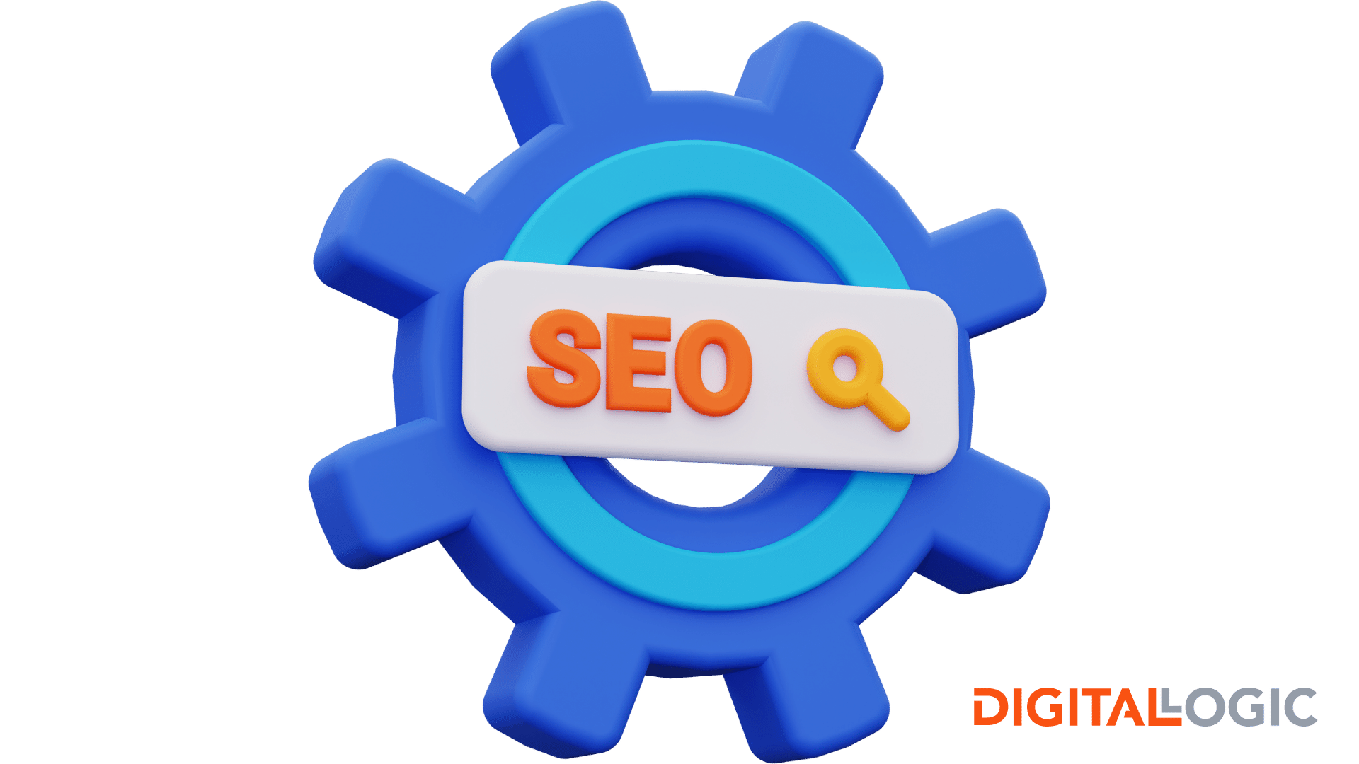
What is SEO?
Regardless of where you are on the online business journey, you need to have a basic understanding of search engine optimization.
SEO has been around for a long time. If you’re just starting your online business journey, we recommend investing in SEO services from a reputable full-service marketing agency as soon as possible.
Paid advertising, or PPC management, offers a “quick fix” for bringing immediate traffic to your website. In contrast, search engine services naturally build up your content and in turn, your ranking on Google’s search engine results pages.
Your SEO strategy should include outbound and inbound links, both of which help increase your ranking in Google and improve your leads magnet. It is important to note that Google considers links coming into your site as more important than internal links.
What is SEO Content?
SEO content is any content that increases your natural search results in Google and the other search engines.
In the past, digital marketers only needed to focus on keywords to outrank competitors organically. Now optimization services should also include internal linking, professional backlinking strategy, technical SEO, as well as optimization for graphics, videos, and podcasts, since all of these digital assets often have their own search directories.
When developing your SEO content, remember that creating and publishing high-quality content is the most important factor when managing both Google and user expectations.
SEO speaks to the search engines, while your website speaks to visitors.
SEO services will help draw attention to your website on the search results pages. From here, factors like website design, web accessibility, and user experience will determine whether the searcher converts.
If you’re having trouble deciding which elements will better convert your visitors, you can perform testing cases or ask for user feedback in exchange for a free promotional product or service. This involves applying a certain degree of psychology about when people shop, what they are thinking when they shop, and how they make buying decisions.
Adding Schema Website Elements to Improve Search Visibility
Schema is a unique type of add-on HTML markup language that increases the probability of ranking high in the search engines. It does this by speaking to all of the four major search engines with technical information that describes what your page is really about.
Usually, the schema information is something extra that may add credibility to your site and branding. At times, it is simply an extra meta tag that tells the searcher what your site is about and may increase your lead generation ability.
Web Design Best Practices for Mobile-Friendly Website Design

Desktop Site vs Mobile Site
One of the factors that you can monitor using Google Analytics or other search tools is the type of device your users are utilizing. Desktop users will show up as Windows or Mac users in your analytical data. You can also see which version they are using.
Mobile users will show up as “mobile users,” and you can also tell what type of mobile device they are using. Once you have this information, you can adjust your web content on your websites and blogs to create a better user experience for your mobile users.
Check your navigation menu, online graphics, video content, and other aspects to see how mobile-friendly your site is to mobile users.
It’s not enough to just look at your site and determine whether it is user-friendly to mobile users. You need to do a mobile-friendly test to determine this. Some web servers offer a mobile optimization option to improve your mobile-friendliness. If you do not have access to this type of tool, use Google’s mobile-friendly test.
Responsive Design
So, what is responsive design? If you are building a website, you need to have an understanding of this component also. Responsive design is a design that is considered to be friendly to any type of user, any type of device, and any format of the user. If your site has a responsive design, it means that your website is designed in such a way that it looks just as good on a mobile device as it does on a desktop computer.
Responsive design is created to give your visitors all an equally satisfying site experience so that they have an equal opportunity to engage with your brand and products. In most cases, if your site passes the mobile-friendly test, it is likely based on a responsive design. But you should test every aspect of your site to make sure this is the case.
Web Design Best Practices for User Experience
Since the World Wide Web Consortium implemented the Web Accessibility Initiative, Google’s search engine crawlers add preference to website designs that offer accessibility options for those who need alternate solutions for online browsing.
Google also gives preference to responsive websites that can be viewed on mobile devices, tablets, or desktops seamlessly.
To start the process of ensuring your site is accessible and optimized for mobile devices, you could try an accessibility checker, create keyboard accessible links, add alt text to all images, or work with a professional marketing agency that can explain your options.
Easy Navigation (UX)
Part of building a responsive site is ensuring that navigation is just as easy from a smart phone as it is a desktop.
Website designers should ask themselves the following questions: Is it easy to find what you want customers to find? Are your products easily accessible to everyone? How easy is it to utilize your shopping cart, browse for products, and make a purchase?
Test all of these website elements before releasing your site to your audience.
Limit Navigation Bar Menu
To improve response rates and results on your website, limit the number of menu items you have on your horizontal navigation bar.
Why do this?
Because limiting the number of choices lets you offer visitors more simplicity and increases the chances they will do what you want them to do. Avoid confusion by limiting the options you give your visitors. But make the choices attractive and interesting to them.
Offer a Website Search Bar
Offering a search bar on your page may also increase your response rate.
Site visitors may want to narrow their search further once they locate your website.
If you can offer a search bar on your page for site search options, you may be able to increase the level of activity on your site. Adding a simple search bar may provide your visitors with an additional website element that your competitors don’t.
Have Readily Available Contact Info
A great example of meeting user expectations is having your contact information where the site visitor expects it.
Always include your contact information on your site as the last thing on your “About Us” page and again on your “Contact Page.”
This is the proper place to put this and this is where people expect to find it. Include the following information on your contact page.
- Name of the company
- Location (if a walk-in store)
- Phone number and email
- Directions/map
Alternatively, you may want to opt for a contact form that allows people to fill out a contact form to reach you. Then you can handle these as they come in. People may also be more likely to fill out a quick form than they will to click on your email links or pick up the phone.
Include Scroll Back to Top Buttons
Providing “back to top” buttons allows you to save the visitor more time when they are shopping or surfing on your site. This also improves the navigation system and increases your UX.
Sync to Website Options
Synchronizing everything to your website with push through notifications for mobile users will help increase your overall customer experience. If you can synchronize your social media sites, blogs, and video channels to your website as well, you will get better results in your branding.
Present Icons on Landing Pages
Using icons that emphasize your logo or other aspects of your website, you may increase your targeted traffic to your website. You can also let people know whether you are online or not with IRC chat applications and other means.
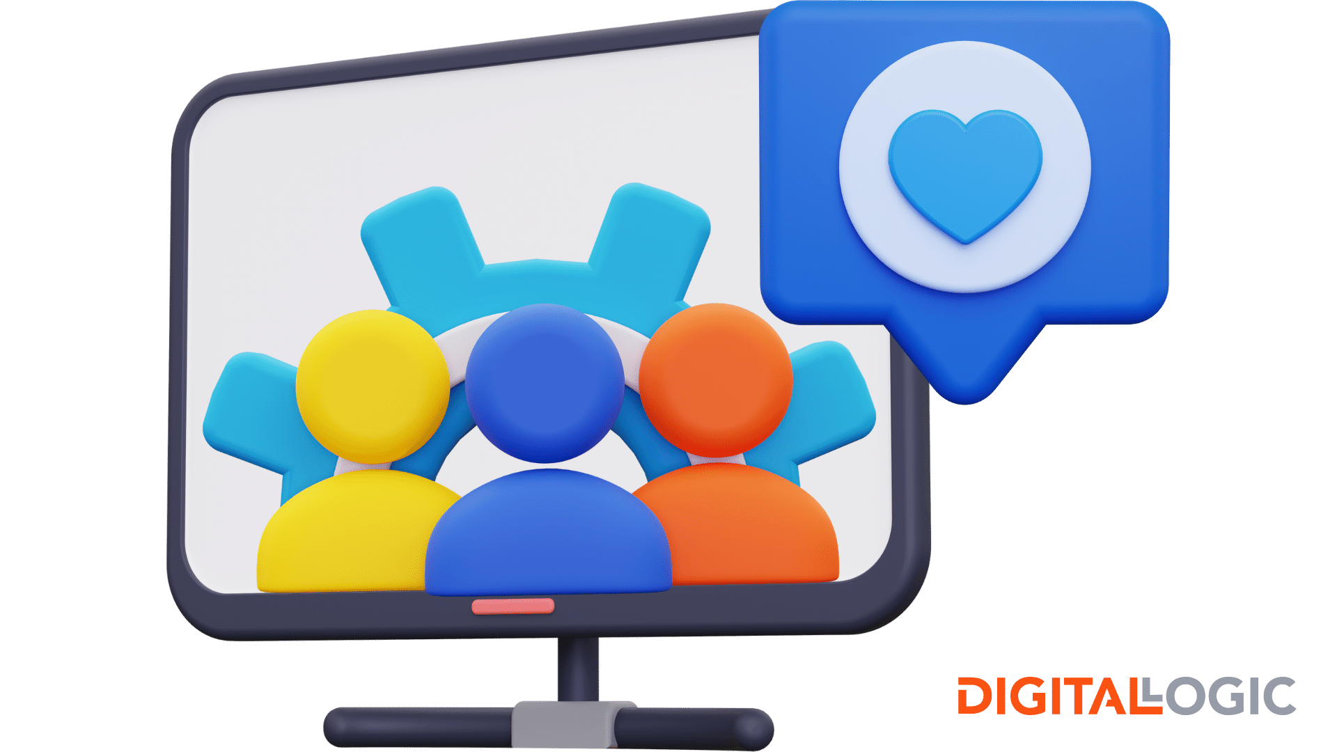
Use Social Media Links to Increase Brand Awareness
Social media is one of the most important ways to increase your following and potential leads. You can use your Facebook to create paid ads as well as making free posts every day or as often as you want.
It is strongly advisable to use all forms of major social media such as Instagram, Facebook, Twitter, and Pinterest to improve your branding online. Remember that the goal of branding is to put your company information out there enough that you become easily recognizable no matter what platform you are on.
Include Chatbot Features
Establish an easy communications link between your customers and your brand by providing contact information and online chat. Sure, some customers may be comfortable filling out a form or calling your office, but there are other customers who would feel more comfortable having their questions answered right then and there.
If you know what you’re doing, or if the person answering the questions has a good understanding of the business, this will also help to instill trust between you and your customer.
Best Practices for Setting Site Performance Goals

Remember that your website should be your “virtual real estate,” the most important asset that you have to help convert sales as well as build your clientele. Communicating value through your online content is critical, as well as setting goals for your brand. You will set your own goals for your business according to what is most important to you. But some of the most important goals are listed below. Below the list is a brief description of each and why it is important.
More Website Visitors
The ultimate goal of an online website is to serve as the gateway to your brand.
Why do you build this gateway to your brand?
Because you want to attract a larger group of people to your brand, right?
Knowing your audience is critical, but you also need to know how to create your website in such a way that it will allow you to attract a larger audience to your products and services than you have done in the past.
For this, we recommend content marketing. What is content marketing?
In a nutshell, content marketing is the skillful use of keywords, SEO, and a variety of other techniques that work together to get your website more organic traffic. Included in this is writing high-quality content, such as the post you’re reading now. See how that works?
Having a blog also helps build value for your target audience. Remember, it’s not enough to gain a customer for a day. You need to build relationships that continue beyond the first sale. This means knowing your audience, offering them value, and adding to that value so that they will want to come back to see what you will do next.
Healthcare Marketing can be a little trickier, so if you’re in this sector, check out healthcare marketing trends, first.
Additionally, if you need help on monitoring website traffic, we provide help for that, as well.
Promote Product or Service Offerings
Of course, without informing your visitors about what you offer, you can make no sales. When you are working on your branding, it’s fine to also promote specific products or services. Just make sure you keep the theme of your brand in your mind as you build your website and other digital assets. That way, everything will work together in the way it is supposed to.
If you create an ad for a specific product or service, make sure that you have a dedicated landing page that correlates to the ad. Nothing is worse than clicking on an ad, only to be redirected to something completely different than you expected.
For more information on this topic, check out our post on How Retargeting Can Help You Achieve a Better ROI.
Work With the Best Web Designers for Small Business Growth
Lastly, combine these various best web design best practices and techniques in your own way. Don’t try to emulate others. Be yourself. In the end, there is no magic formula for success as an online business owner. Just make a great website and speak to your customer through these various methods, offer great content, and give them a reason to return. Small business web design is not as hard as it seems, especially when hiring a web design company.
At Digital Logic, we also provide a range of services for web design and rebuilding, including but not limited to:
